AddThis have just published an infographic – full image after the jump – visualising a few headline insights from 2010.
It’s not the prettiest infographic we’ve ever seen, but the data itself is premium stuff. AddThis operate a bookmarking and sharing service pretty much anybody can use to make their content more viral, with implementations ranging from blue chip to home-fried.
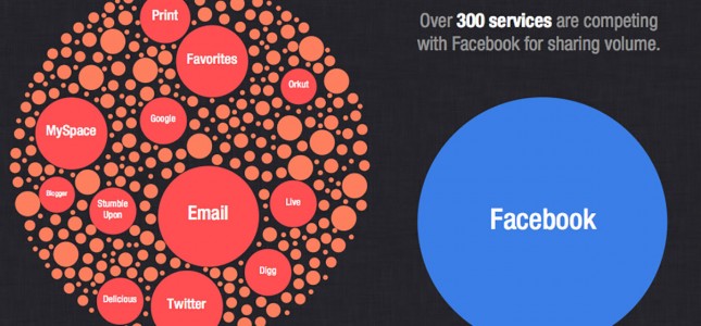
Understanding how end users are choosing to share content online when they encounter the various AddThis widgets and buttons we can add to a website gives us a good steer in terms of how to weight a campaign towards the various services there have to choice from.

What we can take from this – as if we weren’t already aware of it – is that pretty much everything plays second fiddle to Facebook. On these stats even email is secondary, although what this fails to account for is how many of us just paste a link to a page into our email client rather than doing it via an AddThis tout. Where it gets even more unscientific is that AddThis give greater prominence to their more popular services, introducing an element of self-perpetuity that skews their audience even further away from the lesser-known utilities.
It’s interesting stuff though and half-way useful. For most of us we’ll never be able to make the business case for digging as deep as we might like, so while there are still only twenty-four hours in the day this kind of snapshot can always prove handy.